How to Read Crypto Charts: Candlesticks for Beginners
Candles, volume, support and resistance - the 90% of chart literacy worth having, with the honest caveats trading courses leave out.
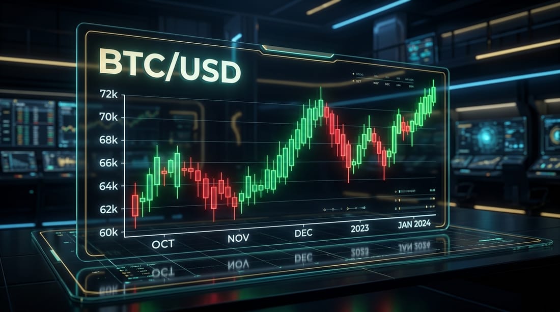
Open any crypto price chart and you'll see a wall of red and green rectangles that traders discuss like tea leaves. Most of the mysticism is noise — but the basic vocabulary is genuinely useful, the way reading a map is useful even if you're not a cartographer. This is that vocabulary, with the honest caveats most trading content leaves out.
One candle = one story
Each candlestick summarizes the price action of one time period — a minute, an hour, a day, depending on the interval you select. A single candle tells you four numbers:
- Open — the price when the period started
- Close — the price when it ended
- High and low — the extremes in between, drawn as thin "wicks" above and below the body
If the close is above the open, the candle is green (price rose); if below, red. The fat part (the body) shows where most of the action settled; the wicks show how far price ventured before being pushed back.
That last detail is why traders care about wicks: a long upper wick on a green candle means buyers pushed price up but couldn't hold it — enthusiasm that got sold into. A long lower wick means sellers drove price down and buyers absorbed it. Single candles mean little; the pattern of who keeps winning these tugs-of-war is the actual information.
Volume: the lie detector
Below most charts sits a row of bars showing volume — how much was actually traded in each period. Volume is the most underrated tool a beginner can learn, because it distinguishes conviction from noise. A price jump on heavy volume means many participants repriced the asset. The same jump on thin volume means a small order moved a quiet market — and can reverse just as easily. In crypto's smaller tokens, low volume is also where manipulation and pump-and-dumps live.
Support, resistance, and trend
Three more concepts complete the basic toolkit:
Support is a price area where falls have repeatedly stopped — historically, buyers showed up there. Resistance is the ceiling version — a level where rallies have repeatedly stalled. These aren't magic lines; they work, to the extent they work, because thousands of traders watch the same levels and place orders around them. Partially self-fulfilling, never guaranteed.
Trend is the simplest and most ignored signal: is the chart making higher highs and higher lows (uptrend), or lower highs and lower lows (downtrend)? Zooming out to the weekly chart to check the trend prevents more bad decisions than any indicator. Crypto moves in large multi-year cycles, and fighting the tide on a 5-minute chart is how beginners donate money to professionals.
Honest disclosure that trading courses skip: technical analysis is a language for describing market behavior, not a machine for predicting it. Decades of research show the vast majority of short-term retail traders lose money — in crypto, with leverage, faster. Charts are worth reading; day-trading your savings is not.
What charts are actually good for
If most short-term trading loses, why learn this at all? Because chart literacy serves saner purposes:
- Context. Knowing whether you're buying into a two-year downtrend or an all-time high changes decisions even for long-term holders.
- Spotting nonsense. A token that went vertical on no volume is a chart telling you to leave.
- Discipline. Watching how often "obvious" setups fail is the fastest cure for overconfidence — and the best argument for boring approaches like dollar-cost averaging.
The takeaway
Learn candles, volume, support/resistance and trend — that's 90% of useful chart literacy, and you now have it. Treat everything fancier as entertainment until proven otherwise, and remember that the most profitable thing most people ever do with a chart is zoom out.
Frequently asked questions
Four numbers for one time period: the open, the close, and the high and low (drawn as thin "wicks"). Green means price closed above its open, red means below. A long upper wick means buyers pushed price up but couldn't hold it; a long lower wick means sellers drove it down and buyers absorbed it.
Volume is the lie detector. A price move on heavy volume reflects real participation and conviction; the same move on thin volume is easy to fake or fade. A breakout with no volume behind it is the classic trap.
Support is a price area where buyers have repeatedly stepped in; resistance is where sellers have. They're not magic lines — they're a memory of where crowds acted before. Useful for framing decisions, dangerous if you treat them as guarantees.
No, and anyone selling you that is selling mysticism. Charts are good for understanding what has happened and managing risk — where you'd be wrong, where to set a stop. They describe the past and the present mood; they don't foretell the future.
Keep reading




Popular this week
- 01Rug Pulls Hall of Shame: Famous Crypto Exit ScamsAnalysis · 4 min
- 02Grid Trading Bots Explained, and When They Blow UpGuide · 4 min
- 03Where AI and Crypto Actually Meet: Compute, Data, and DePINAnalysis · 9 min
- 04Modular vs Monolithic Blockchains: The Design FightExplainer · 6 min
- 05How to Spot Wash Trading and Fake VolumeGuide · 5 min